
B B B U R R I T O S
An energizing order ahead experience

The Challenge
BB is a local quick service restaurant with four locations in the San Francisco Bay Area. Their menu focuses on perfectly sized, never messy breakfast burritos made with fresh, locally sourced ingredients. They cater to commuters, with the heaviest traffic in the morning and a steady stream of business through lunch. They wanted a branded mobile app experience that encourages and streamlines ordering ahead, and increases sales overall.
H I G H L E V E L G O A L S
Design an end-to-end mobile app experience
Make using the app the easiest way to order ahead
Include features that increase conversion and loyalty
Define the BB brand and visual identity
R O L E
UX Research
Product Design
Brand Design
S C O P E
Personal Project
iOS App Design
T O O L S
Figma
Photoshop
The Solution
The TL;DR version. Scroll on for a more chronological unfolding of events…
Simplifying signup
A mobile app shouldn’t require your email address and password, but the experience does get better when you have a secure, personalized account.
Get started with just your phone number, then add more account details — like preferred location, saved payment method and dietary preferences — from there.

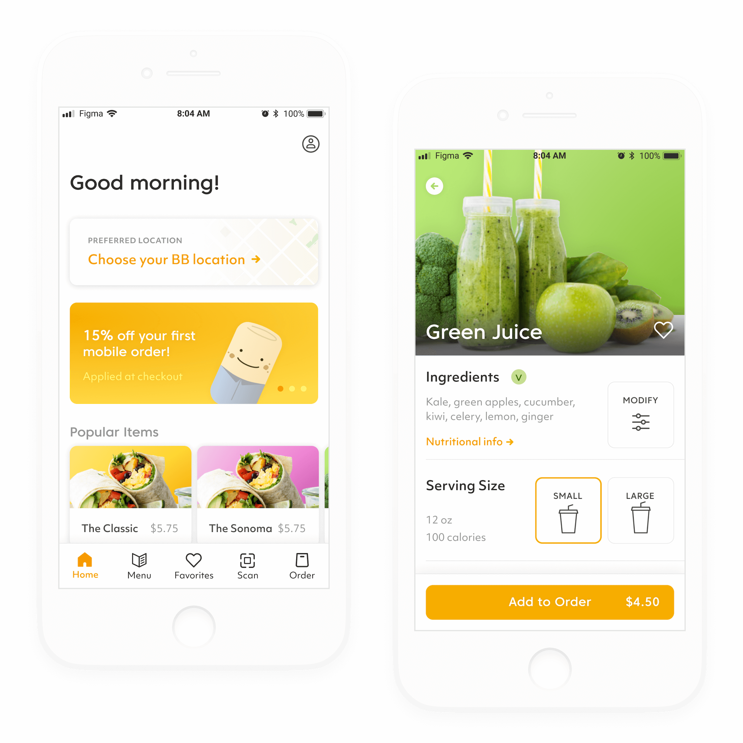
Keeping things fresh
Think breakfast as an energy boost, not an afterthought. Can we encourage a better relationship with breakfast (and more return visits) through a brand?
With bright colors, fresh photography, a clean UI and a friendly mascot, you can start your day with some positivity — then bring that good mood all the way to your desk.
Prioritizing convenience
Weekday mornings are about — you guessed it — getting work done. With time limited and your focus elsewhere, you need an app that does the heavy lifting and fits into your routine, whatever it may be.
Fast reorders, at-a-glance (and accurate) statuses, smart recommendations and a scan to pick up make every second of your morning count.

Try out the prototypes
The Process
All the nitty-gritty (but still summarized) details about how I got there.

Empathize & Analyze
Market Research
User Interviews
Competitive Analysis

Define & Ideate
Goal Definition
Feature Roadmap
App & User Flows

Design & Test
Wireframes
User Testing
Hi-Fi UI
Empathize and Analyze
For my research stage, I wanted to understand the following more deeply:
Who is the target audience for this app?
What physical environment and mindset are they in before work?
What issues do they face when making breakfast decisions?
What may positively impact purchasing decisions?
What is working / not-working about competitors services?
A N O T E A B O U T S C O P E
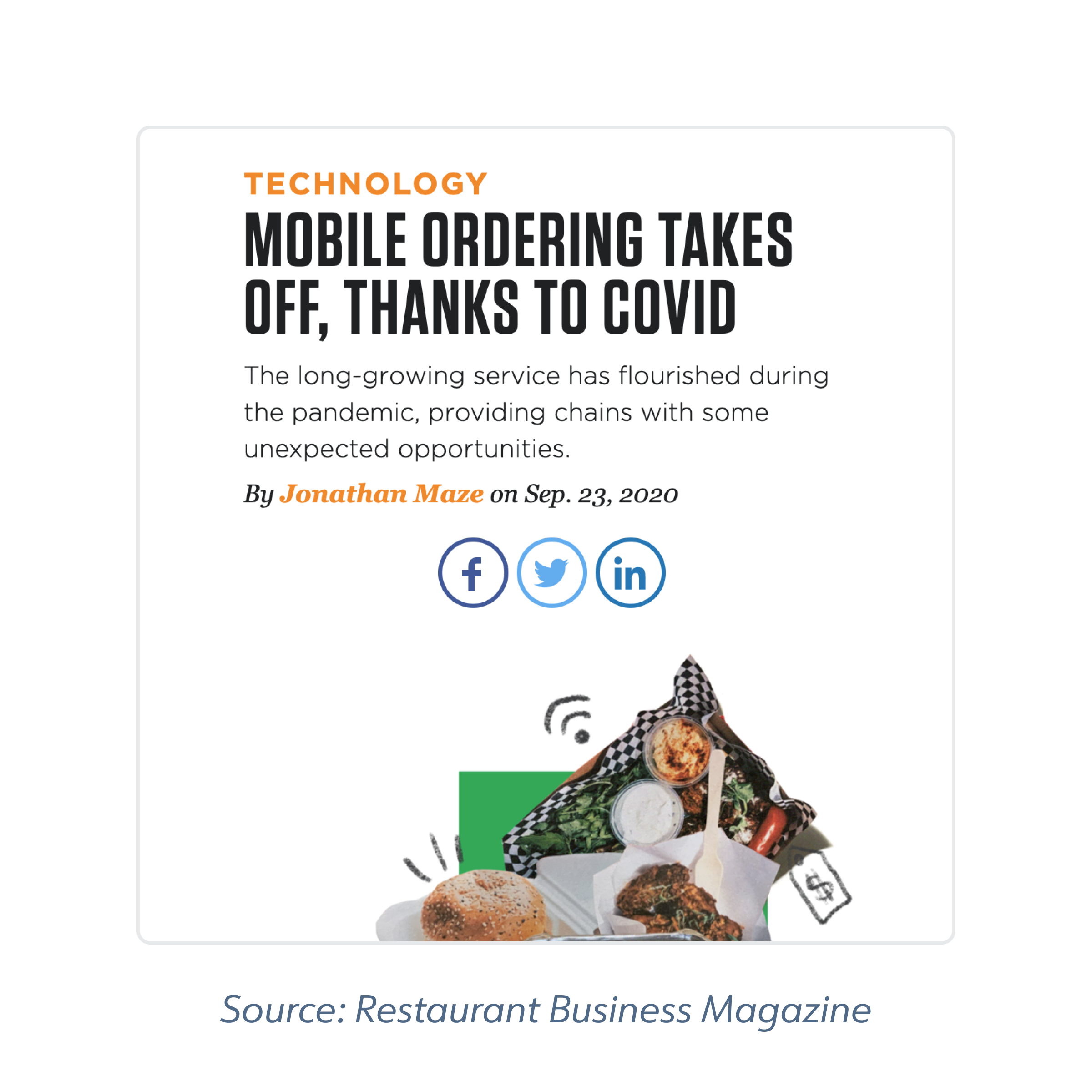
Restaurants have been dealt a heavy blow by the pandemic. A business like the fictional BB would be considering a lot of different interventions right now — not just an app to increase sales.
For the scope of this project, however, I decided to look ahead to a time when we are are safely back in the office, with a sustained appetite for pickup services and an increased expectation of mobile and online ordering.
Therefore, my research focuses heavily on the app experience, people’s commuting and breakfast-eating habits pre-pandemic, and industry / consumer expectations for the future.
Understanding the market
To kick off this project, I wanted to get a sense of trends in the quick service industry, data on consumers, and best practices when it comes to order-ahead apps. A few notable findings:

40% of millennials’ food orders
are for pickup
The millennial audience leads in takeout ordering, with less reported time to cook at home. Beyond convenient ordering, they are influenced by discounts, sustainability, social responsibility and customization.

Branded MOAs can boost sales
and retain customers
Mobile ordering apps can increase sales by 20%, with streamlined ordering, direct promotion channels and automated rewards. With the limited space on consumers’ phones, brand is becoming increasingly important.
The ordering experience is key,
followed by rewards
Mobile ordering continues to go up and, because of the pandemic, brands have seen more first-time users. Whereas “rewards” and “ordering” used to be equally important features, “ordering” is now twice as important to users.
Complicated login methods
are the worst
40% of consumers say that multi-step login methods are the top cause of frustration when placing orders with apps. They are aware of more user-friendly aggregator apps’ high fees, however, and want to support local businesses directly.
Getting to know consumers
For a fuller picture of my audience, I decided to interview four people that matched my basic criteria:
Between the ages of 24 - 36
Have a commute to their office in SF
Have experience with using food ordering apps
After the interviews, I organized my raw data into themes using an affinity diagram. I then pulled out key learnings and worked them into user needs statements to share with stakeholders.

0 1 / L E A R N I N G
M-F breakfast: if it’s not convenient, it’s not happening.
Regarding consumer mindset: people are thinking about work; they are anxious to get started. They don’t want waste time or extra mental energy.
Those that eat breakfast regularly (because they’re always hungry in the mornings, or they realize it energizes them) have built it into their routine: something quick, easy, repeatable.
They enjoy breakfast foods and know the first meal of the day is important... and yet, they don’t have time to prep at home and might end up skipping it. While a satisfying breakfast is a highlight of weekends, on M-F it’s “a luxury.”
= U S E R N E E D S T A T E M E N T
To choose to eat breakfast and purchase from a business, people need offerings to fit their routines.

0 2 / L E A R N I N G
“Ordering ahead” doesn’t necessarily feel like a good habit.
Everyone knows how ordering ahead makes life easier. But, when it comes to people’s wallets, frictionless payment and a record of how much they’ve eaten out can make them feel guilty — unless it’s connected to a clearly valuable habit.
For the person who needs total convenience, ordering and reordering fast is obviously valuable. And for the person who believes a $15 salad is “good for them,” spending money feels more like an investment (and even accountability).
= U S E R N E E D S T A T E M E N T
People need to feel that ordering ahead / ordering BB is valuable in relation to their time and health.

0 3 / L E A R N I N G
Takeout breakfast is perceived as delicious, but not healthy.
People tend to think of buttery pastries, bacon sandwiches and bagels when grabbing breakfast to-go. This furthers the feeling of “indulging” instead of energizing — even when compared to skipping breakfast, grabbing a sugary yogurt cup, or consuming the office donuts (at least those are free!).
More health-conscious folks look for freshly made items with high quality ingredients, as well as markers like “whole wheat” and “egg whites.” Overall, they want to make sure they feel good at the start of their day.
= U S E R N E E D S T A T E M E N T
People need breakfast choices to be fresh and of high quality to feel good about choosing them.

0 4 / L E A R N I N G
No one’s got time for surprises on weekday mornings.
In general, users don’t like extra noise when they’re trying to get something done — but their patience for those types of things when they are 1) preoccupied by work and 2) hungry becomes even lower.
Consumers described: never trying an order-ahead feature, despite using an app for years, because it wasn’t totally clear how they’d pick something up; their disgust at ordering ahead and their items not being ready when they got there; their desire to support a local business but wariness of saving payment details to a “crappy app”; and total disinterest in overly complicated rewards schemes.
= U S E R N E E D S T A T E M E N T
People need clarity, consistency and simplicity in order to stick with a business and an app.
Defining who we’re building for
To keep myself focused on my target audience’s needs throughout the rest of the project, I created two simple personas.
Both of these imagined users are existing customers, work nearby a BB location, and eat there at least once a month.


Learning from competitors
Next, I moved onto identifying direct and indirect competitors to evaluate their strengths and weaknesses and look for popular patterns.
I focused on highly rated apps, known for their high quality, healthy and/or tasty offerings and approachable brands, and compared signup flows, navigation bars, product pages and branding. A few examples:

Define and Ideate
I wanted a clear product vision and sense of priority features, based not only on users but the business as well. With that in mind, I took some time to re-articulate my goals and brainstorm value props that felt aligned.

Thinking through features
To keep the wheels turning on feature ideas, I worked my insights into more actionable “how might we” statements:
How might we...
Make the app fit into people’s mornings?
Make ordering from BB / ahead feel valuable?
Present offerings as healthy and fresh?
Ensure no derailing surprises?
I used these prompts to brainstorm more features of the app and aspects about the brand and UI.
Next, I listed and prioritized using the MoSCoW method, resulting in a feature roadmap.

Organizing screens
With my priority features decided on, I wanted to ensure I wasn’t missing any key functionality, so I mapped out the app’s basic structure.

Planning for interaction
I also made two simple user flows to model out a user’s first visit and a return visit. This helped me spot key interactions, costly decisions points, and areas that would need more think-through.


Design and Test
Time to dig in. With my roadmap, flows and pattern research handy, I put together my wireframes and created a prototype in Figma.
I kept these screens simple so that I could test for information hierarchy and general app flow before iterating on UI and brand.

Testing and iterating
I tested my mid-fidelity prototype with three users, asking them to complete tasks and think aloud. I observed each test, so I was able to capture a range of issues and ask follow-up questions.
Overall, the features were recognizable and the key screens were all there — but there were definite areas for improvement:
I S S U E 0 1 / S I G N U P
Users ignore signup — and the business loses out

Users chose to “Skip” when presented against “Create an account.” This made sense: people assumed account creation would be time consuming and clunky, and wanted to get to their order. However, every time a user chooses this flow, the business misses out on powering time-saving features (location, payments) and upselling opportunities (notifications, personalization) down the road.
With signup modeled after mobile-first apps like Lyft, account creation had the potential to feel lightweight. I decided to lean more into that model by requiring signup, but repositioning it as “Getting started.” By presenting only one option that leads to the native signup flow, the choice was simpler and trust reached faster. I also moved the app / account value props closer to the carousel, to make the connection clearer.
I S S U E 0 2 / A D D I N G T O C A R T
Users expect immediate feedback and next steps

In my basic prototype, it wasn’t totally clear when items were added to your cart. Testers patiently waited for something to happen before moving on. Then, navigating back to the menu via the upper-left arrow felt awkward — users expected clearer options.
To build confidence, I added a new button state as a progress indicator. To address the navigation issue, I added a sheet that did three things: confirmed your added item, made it easier to checkout or go back to the menu, and showed you relevant add-ons (which felt like a win for both the business and users).
I S S U E 0 3 / C H E C K O U T F L O W
Two screens > one page with the kitchen sink

With convenience in mind, I tried keeping the checkout flow to one screen with a single CTA. However, for a new user without details saved, it ended up feeling tedious with front-loaded asks for location and payment, and having to tap in and out of new pages.
I decided to change it to progressive screens, with “Review order” (a reminder of your order’s value) followed by “Confirm details.” I also gave location and payment a sheets style, so they felt like pitstops within the main flow, instead of breaks — while still retaining an easy way to adapt the content for fullscreen from Settings.
Envisioning a brand
As I was making headway on the UX, I was also thinking about the brand and UI — specifically about how a visual identity could support our “how might we” statements around health, value, clarity and convenience.
I started with a mood board on Pinterest and some brand words as guidance. I used these to develop two possible visual directions.
The feedback I got pointed to the first as a better fit for the audience: it felt fresher (like “a morning sunrise”), faster and more techy — akin to a polished consumer-facing app vs. a mom-and-pop cafe.

1. Bright, playful, satisfying, energizing

2. Light, friendly, homegrown, uplifting
L O G O
A mascot to brighten your mood
As for the logo, I had an idea for a breakfast burrito character that could brighten someone’s morning and humanize the brand (which might subconsciously reinforce the decision to keep an app installed).
I started with sketches and gradually worked it into a logo with a different versions for a loading screen, the app icon and various creative.


E L E M E N T S
UI that sets you up for success
I wanted the app to feel clean, energized, efficient — aspirational for the start of your work day. This meant generous white space, bright accent colors, and just the right amount of detail (with clear ways to view more).
I also considered physical environment: using the app with one hand while on a BART train, or ordering while speed-walking to the office. This meant larger touch-targets to reduce errors and consistent styling for easy learnability.
Taking it Hi-Fi
To keep things consistent and speed up the process of generating final screens, I followed the atomic design methodology, building reusable components. I also fine-tuned colors and font styles, trying to balance user-friendly clarity with a bright, saturated brand.


Try out the prototypes
Next steps
A few things I might do if I were to spend more time on this project…
Optimizing onboarding
In testing the final prototype, I noticed that some people automatically said no to turning on notifications. Then, after checkout, they wondered aloud how they’d be notified when their order was ready. Maybe moving this ask out of the account creation flow and/or adding a post-checkout prompt would make it more valuable in context.
It would be great to run A/B tests to see how much friction in the signup flow adds value and quality, over inconvenience. For example, would collecting dietary preferences or location upfront speed up checkout? Could asking for a user’s name make ordering and pickup more personable, and increase retention? I’d love to test a few different versions.
Considering physical environments
For commuters traveling by car, it might be helpful to incorporate speech recognition technology for a totally hands-free ordering experience — which of course would positively impact accessibility overall. What other environments and contexts could we optimize for?
As for how the app interacts with the in-store experience, I thought a bit about scanning for payment and pickup. It would be interesting to take this further, depending on the store’s technology. For example, could it tell you which station to collect your food, or unlock a station holding your order? As the pandemic has pushed more restaurants towards “ghost kitchens” and contactless pickup, how could the app adapt?
Adding group orders and payment
Interviewees mentioned being happy to pickup orders for colleagues, but that it was often awkward or tedious to collect what they were owed. An app that could share a cart link, but allow invitees to pay separately would be a big value-add — and incentivize people to choose BB over competitors.
View more projects

Love School Website

thredUP Seller Flow